
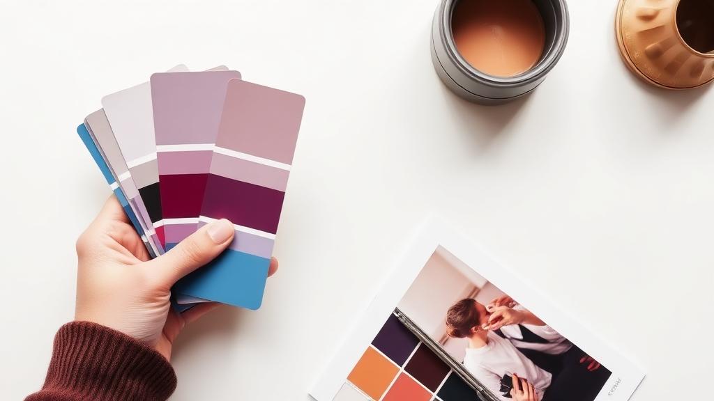
Building a Brand Color Palette From a Single Image
How designers extract palettes from photos, illustrations, or mood boards — and how you can do it in two minutes.
Why this works
A photograph that captures the feeling of your brand already contains a coherent palette. Extracting it gives you colors that work together because they appeared together in nature or in a thoughtful composition.
This is much faster than picking colors from scratch and gives more emotional consistency.
The five-color rule
Extract a dominant, an accent, two neutrals, and a contrast color. That's enough for a full brand system.
Test the contrast color against the dominant for accessibility. WCAG AA requires 4.5:1 for body text.
Locking it down
Save the hex codes in a single file. Use CSS custom properties or design tokens. Never let designers eyeball-pick a near-match.
When the palette is in one place, every new design uses the same colors. That's what makes a brand look 'put together'.
Related articles



Sneha Iyer writes for WebToolCenter on SEO, AI, and productivity. Every article is researched, tested with real tools, and updated as best practices evolve.
More about our team →Discussion (0)
Sign in to join the conversation.