Favicon Design: 6 Rules for an Icon That Reads at 16px
Your favicon shows up in browser tabs, bookmarks, and search results. Most are unreadable. Here's how to fix that.
Design at 16x16 first, scale up
The favicon is most often viewed at 16x16 pixels. Designing at that size forces you to remove everything that won't read.
Single-letter monograms and bold geometric shapes work. Detailed wordmarks and gradients do not.
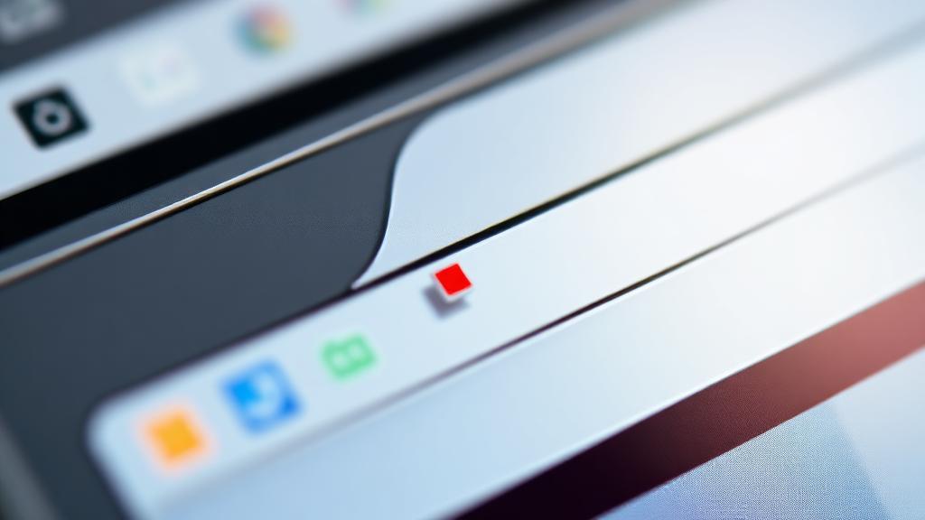
High contrast, simple silhouette
Use two colors max. The silhouette should be recognizable in pure black on white. If it isn't, simplify.
A favicon shouldn't try to be your full logo. It's a recognizable mark, not a brand asset.
Export the right sizes
You need at least: 16x16, 32x32, 180x180 (Apple touch), 192x192, 512x512 (PWA), and an SVG fallback. Most favicon generators handle this in one click.
Related articles


Rahul Kapoor writes for WebToolCenter on SEO, AI, and productivity. Every article is researched, tested with real tools, and updated as best practices evolve.
More about our team →Discussion (0)
Sign in to join the conversation.